


 BEFORE ANOTHER YEAR has passed me by I wanted to show you some sign painting I did last year for two local friends. The first was for Yuli Sømme of Bellacouche Felt Studio - whose wonderful local Devon wool creations I'm sure many of you will be aware of. I painted a sign for her door, a long thin double-sided A-board, and a free-standing sign for further up the lane, or outside the door. These photos (apart from the one to the right at Yuli's new studio) were taken back when Yuli and I were studio-neighbours: we've both got new premises now! I based the letters on a medieval Devonian alphabet, and the ornamentation was inspired by Yuli's recurring leaf motif.


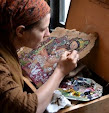
I have always enjoyed lettering - something I grew up watching my sculptor parents do (though their many lettering jobs were carved in wood and stone rather than painted). I learnt to strive for a pleasing serif, and found much delight in making artistic yet balanced, properly weighted letter forms. Beautiful alphabetry is harder to find these days with generic plastic shop signs and computer-fonts muscling in everywhere you look. I do not, however, consider myself by any means a signwriter! My lettering has an artistic wonkiness to it, and liberties taken with spacing that you'd never find under the brush of a professional signwriter. The sign painting I do is the result of an artist making lettering, and cannot compare, for example, to the stunningly exquisite signwriting by my friends Ash and Sarah Bishop at The Brilliant Sign Company, or to the beautiful letterwork of Andrew Grundon at Signature Signs. But I continue to love lettering nevertheless!


These signs were made for another local friend - Davide Brady-Picone's acupuncture clinic. He wanted something traditional and Victorian-flavoured, with a recurring fern motif.


All the lettering takes me a ridiculously long time. And these ones were particularly fiddly, as I was using oil-based eggshell paints which had to be warmed on top of a heater before they were liquid enough to work with.


I made four signs for Davide - a large one for over the door, two smaller ones to lead people up the stairs and an A-board for the pavement outside.


These following photos below show off the signs best of all - they were taken by another local Dartmoor talent - Juliette Mills - a very fine photographer indeed - and show the signs on display between florist and wine shop!
 |
| © Juliette Mills Photography |
 |
| © Juliette Mills Photography |
 |
| © Juliette Mills Photography |
 |
| © Juliette Mills Photography |


13 comments:
Such beautiful lettering Rima, and I think if the letters are a tiny bit wonky then all the better,, although they don't look to be. The signs are wonderful. Wishing you both a merry Solstice x
I was always curious about how you did your beautiful lettering. I used to think 'Surely she didn't just draw it like that?' But you do! And I am truly amazed by your skill and patience.
I have always wished to be able to freehand like this...yours is beautiful and not at all wonky.
Completely lively signs- and the overall effect is that of a metasign apart from the lettering informing the passerby "here is a portal to a magical place away from your everyday world".
I love these, they are beautiful. I would love to practice doing something like this, as they really do announce entry to another world, as Eleanor Alice said, and I love both the signs and the promise.
Your 'clients' must be delighted with their signs. The lettering is perfect for each establishment and invites one to enter and partake of whatever is on offer.
Glad you make these lovely hand-painted signs. Yes, hand-lettering is a rare creature nowadays. I do graphic design among others arts, and I think people only imagine gaphic design as some computer thing (that's why I call it 'graphic arts' instead). Although I use computers, I still do lettering by hand. I have several 'fonts' I use that I made up; though I havn't yet developed them as computer fonts and probably won't. I prefer the appearance of hand letters anyday.
A good sign makes all the difference
these signs have such life and movement; beautiful
Gosh, those are gorgeous signs!
I think these must be the loveliest of signs I've ever seen! You are so clever and what a steady hand you must have. I had a go recently but traced the lettering to get the shapes right. The 'colouring in' was enough of a challenge for me! I shall look out for these signs when I'm over that way. :)
Jess xx
Oooooo... they are beautiful.x
so beautiful! If we were on the same side of the ocean you'd be the answer to my dreams...
Lynetta
Post a Comment